
Brand Guidelines
We’ve created some guidelines to help you leverage our trademarked brand assets without having to negotiate legal agreements for each use. To make any use of our marks in a way not covered by these guidelines, please contact us at [email protected] and include a visual mockup of intended use for our written approval.

Usage
The BigID marks include the BigID name and graphical icon, combined representing the “logo”.
Please avoid modifying the marks or use them in a confusing way, including suggesting sponsorship or endorsement by BigID, or in a way that confuses BigID with another brand (including your own).
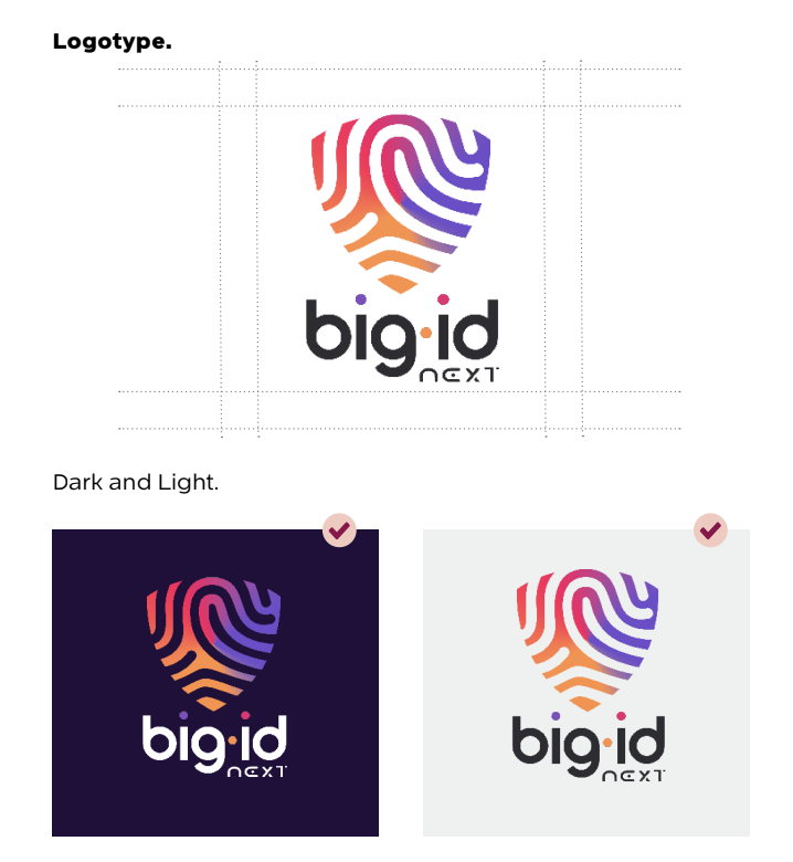
Clearspace
Clearspace refers to the area around the logo which must remain free to maximize impact and ensure that the logo is not obscured. Elements that must remain outside of the clear space include the layout edge, copy, imagery, logos, and any other graphic elements. As the diagram indicates, the clear space to that of the x-height of the uppercase “B” in the BigID logotype, and double the space for the mark. The specified clear space is only a minimum requirement. When possible, allow as much space around the logo that is available.
Download Logos
Download our brand assets.
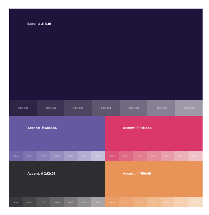
Colors
BigID’s visual identity is built on a bold yet modern palette that strikes a balance between enterprise-grade confidence and innovative edge. Each color has a role — from primary hues that anchor the brand to accents that add energy and clarity across use cases.
Usage Guidance
-
Prioritize clarity and contrast — accessibility is key.
-
Pink is primary — let it lead, but don’t be afraid to let the accents pop.
-
Use accent colors strategically: to highlight, not overwhelm.
Industry Leadership